November 4, 2022
Top 6 UI Design Golden Rules
User interface (UI) design is one of the most important aspects of any digital product. When it is done well, it will result in a seamless and enjoyable user experience. However, if UI needs are not considered or done poorly, it can frustrate and confuse users, leading to users leaving a website and abandoning a product or potential sale.
To make sure your UI is done correctly and you never have content abandoned or are on the line of losing customers because your website “doesn’t flow,” follow our top 6 UI design golden rules.
What is User Interface (UI) Design?
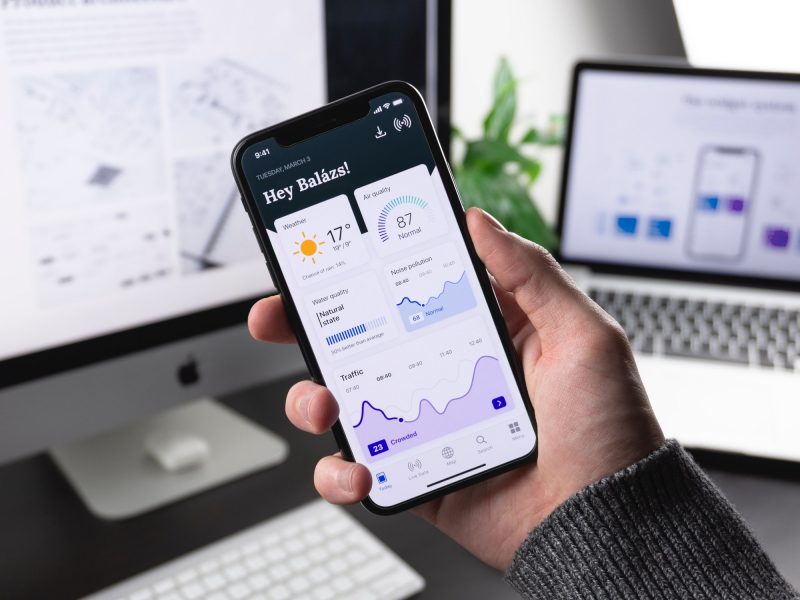
User interface design is the creation of all visual elements a user experiences when interacting with a digital product. The user interface is where human users provide input to the computers or machines they interact with. From the touch screen on your cellphone to a website you scroll through – these devices all have an interface that provides movement and direction in a visually appealing way. This movement can be anything from buttons, text size, colors, images, and layout.
A user interface sets up the “mood” within an experience or, conversely – can destroy a mood with horrible design and poor utility. For example, 88% of users are less likely to return to a website after a bad user experience, and a study by PWC found that 32% of customers would leave a brand they loved after just one bad experience. Just a single bad experience!
To make sure that you don’t lose any customers and that your website or app is built correctly, follow our top 6 UI golden rules:
- Make it easy to use
- Pay attention to colors
- Use typography
- Layout matters
- Less is more
- Test, test, and test again including with end users!

Make it Easy to Use
This seems like a very obvious rule, but you would be shocked at how many websites and apps are challenging to use. If users think too much about how to use a product, they will likely get frustrated and leave. If they need help understanding your product, there is a higher probability that they will leave. About 46% of consumers said they would leave a website if they couldn’t immediately understand what a company does. All UI should be self-explanatory – and users should understand how to use it intuitively and what the company is trying to accomplish immediately. If they are burdened by additional tasks, buttons, or even pop-ups, they will leave and not return.
Pay Attention to Colors
Choosing the right color within your design can also evoke an emotional response and specific feelings within the user. For example, using the color blue can be seen as serene and trustworthy, while pops of the color red are bold, aggressive, or dominant. The right color will ensure that your brand and message align with the feeling you hope to instill within your target audience.
Having different colors on your website than you would on your mobile app causes a disconnect between your platforms, creating confusion with your user. If you need colors for non-digital media, you can get away with choosing complementary colors, but for work and branding within the digital landscape, be consistent with your colors. When properly utilizing color theory, users should easily transition across all mediums without realizing it.
Use Typography to Your Advantage
Typography is another important aspect of UI design – it can guide users through a journey, help them understand hierarchy, and add personality to a product. There are many fonts to choose from, so make sure you select ones that are easy to read and pair well together.
Use a serif or calligraphy stype font for headlines and titles; then, with body copy, use a rounder, simple sans serif so users can easily read or scan without causing too much “font noise.” Using typography in your branding work and letting it weave its way throughout all pieces of content is another way to build recognition and brand consistency.

Layout Matters
The layout of your UI is just as important as the other visual elements. A well-designed layout will help users understand the information hierarchy, direct their attention to essential features, and create a visually pleasing experience. The layout is extremely important when it is boiled down to what is needed for mobile or web optimization. For example, the layout for both mobile and web need to be thought through in detail as they require different breakpoints with different responsible layouts or features.
If your website and apps are not properly optimized with the correct format, users are 5X more likely to abandon your site or app and go elsewhere. The layout is important for web and app design, so make sure you are taking the time to create a layout that is easy to use and navigate – for all platforms involved.
Less Is More
This rule applies to many aspects of UI design, from the number of elements on a page to the amount of text used. With UI design, less is more. Too many elements on a page can be overwhelming and cause users to bounce. Using too much text can also be detrimental, as users are more likely to skim or skip over large blocks of text. Use imagery and whitespace to break up the text, and only include the most critical information. When you give users too many options, they freeze. If you provide a user with a fixed amount of good options, they can make quicker decisions. Try not to have anything extra or unnecessary – every element should serve a purpose.
Test, Test, and Test Again!
After you have designed your UI elements and laid out your website or app – you need to test everything! Make sure the color scheme is easy on the eyes, the content isn’t overwhelming, and the overall experience is seamless. While you should have a team focused on the code testing of the site, this part of the testing process should focus on testing your customer reactions.
Create a testing environment can be done in-house or with outside help. Some flexible customers will accept the task of evaluating your design with crucial feedback. Many user testing tools are available, so find one that works best for you and your team to evaluate user response. User testing will help you identify areas that need improvement and ensure that your UI is easy to use and understand.
Flint Hills Group Focuses on UI Design
Our FHG team always ensures UI is a high priority when building custom apps and projects. We understand the importance of UI and how it can make or break a product. By following these top 6 UI design golden rules, we create beautiful and effective UI designs that our clients love. Our US-based agency is a full-service digital agency specializing in custom app development, web design, and UI/UX design. We are passionate about building beautiful and effective digital products that our clients are proud of.
Contact us today to chat about your next project! We would be happy to help you every step of the way, from initial planning to launch day (and beyond).
Julie Simpson
Technology Enthusiast
Julie Simpson is a freelance writer, SEO consultant and technology enthusiast from Lucedale, Mississippi. When not writing articles and updating websites, she can be found working on her 7-acre farm with her husband, daughters, and assortment of plants, chickens, dogs, cats, and sheep.

Julie Simpson
Technology Enthusiast
Julie Simpson is a freelance writer. SEO consultant and technology enthusiast from Lucedale, Mississippi. When not writing articles and updating websites, she can be found working on her 7-acre farm with her husband, daughters, and assortment of plants, chickens, dogs, cats, and sheep.
